


Eliminating over 3,000 DOM elements and improving accessibility along the way
All I had to do was fix the silly bug I had introduced in the first place 🐛😂


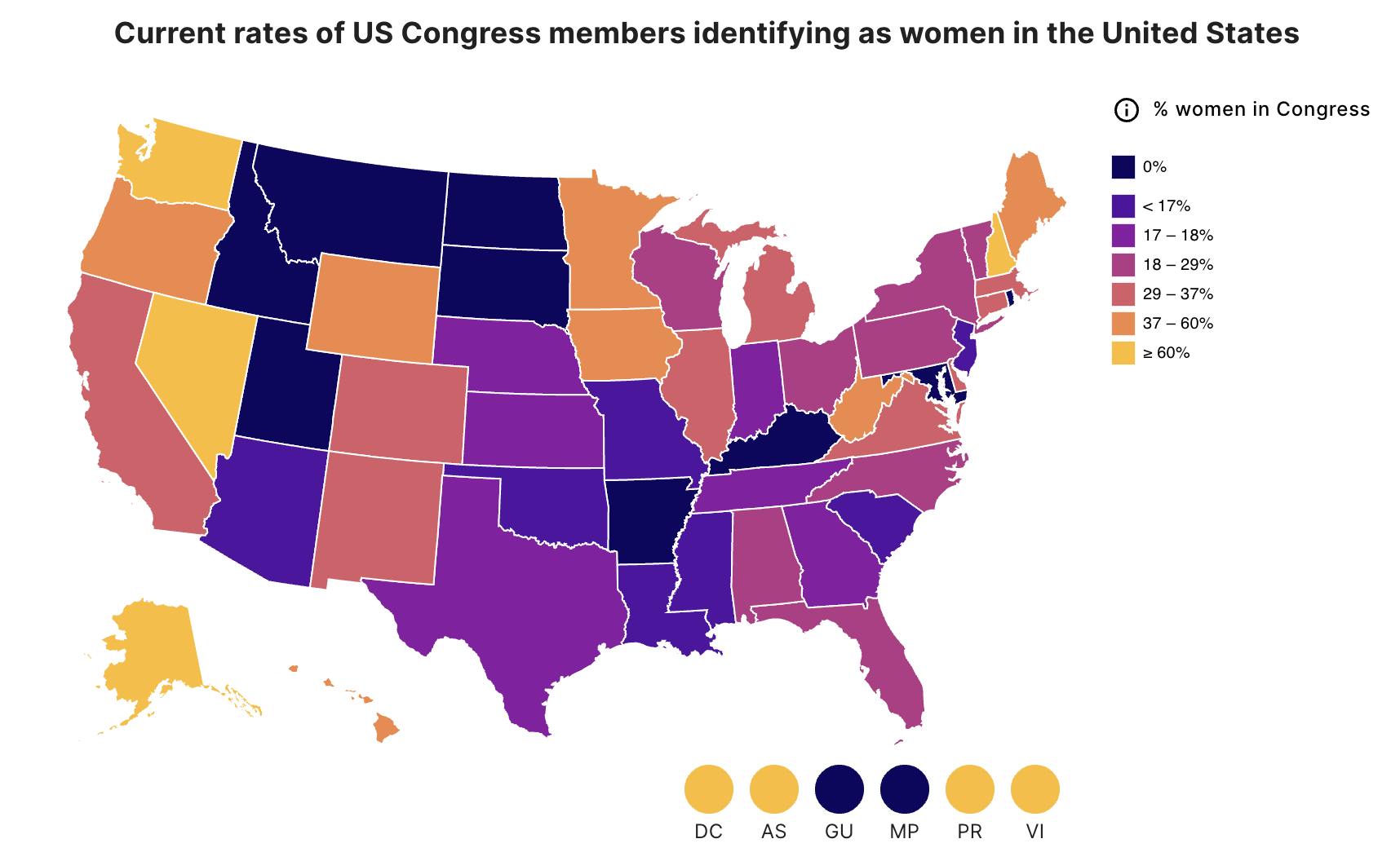
With the Health Equity Tracker, we display a lot of data visualizations including choropleth maps (where data is represented visually with color and shade). Unfortunately, these types of graphics are inherently inaccessible for visually impaired users, and the driving goal of our site is ensuring data is available to everyone!
Last year, I spent a lot of time improving accessibility, including some open-source contributions upstream to fix the 3rd-party package we are using to render Vega.js using React. My best (somewhat hacky) solution for this data issue though, was to render duplicate invisible text elements with the geography name and data point alongside the visible map shape. This allowed a screen-reader user to "walk" through the listed items on the map and hear each item's information.
This inflated the DOM size, but I didn't realize by how much until recently! I figured there would be roughly twice as many elements... half visible, half not... turns out I was accidentally reproducing the ENTIRE accessible dataset several times: for the primary map as expected, and also for every small territory circle we produce under the main map. This means in some cases I was generating THOUSANDS more invisible elements than expected (56 states and territories 7 Vega.js components up to 10 maps with one per race group in our multimap mode)!!! Even worse than the additional work for the browser caused by that many elements, the screen reader user would have to skip over those additional 6 lists, hearing duplicate information each time.
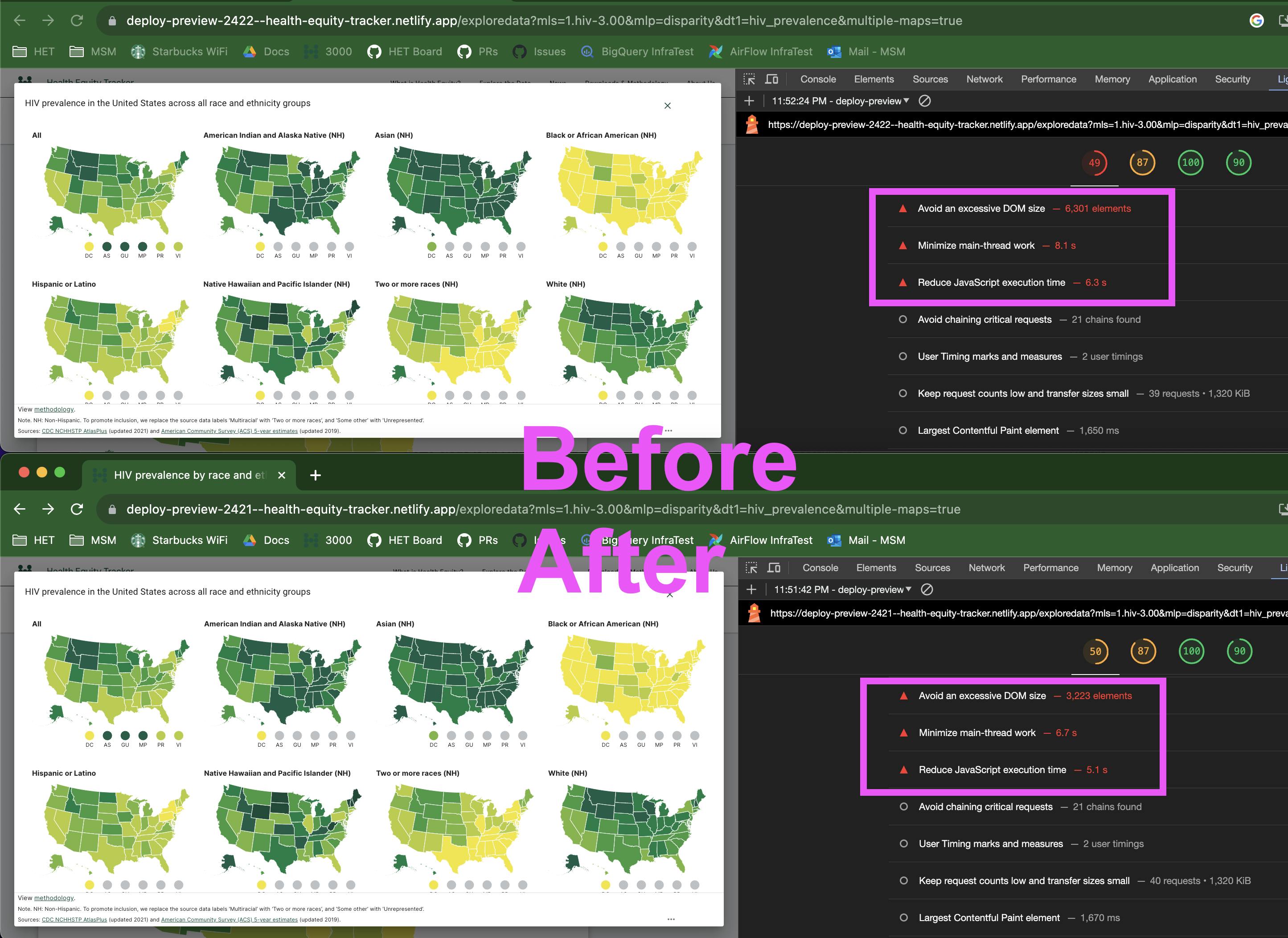
As you can see from the lighthouse report, there are still TOO MANY ELEMENTS, but cutting back from over 6k to over 3k is a big step in the right direction! Beyond the code improvements, I'm also excited to start incorporating ML in generating human-readable insights from datasets for situations like this (and importantly, to present the "insight" text for ALL users since it could help everyone in understanding the map data). Anyone else working on similar accessibility projects or have innovative data visualization solutions to share?